
The Infor Design System will be going public end of May 2018.
Stay tuned for more work!
Introduction
Here at Infor, we have a lot of end users with a specific needs. Our products span all industries from Aerospace to Construction and Retail to name a few. In addition, our product teams are located across the United States and abroad.
Background
Over time, a design library called Soho was built out by a team of dedicated designers and develops who saw a lack in consistency across products. They wanted to create a central place where users could easily find information about components, color palettes and other design assets.
They were receiving a lot of independent requests to review a product’s experience. From workflows to new icon and feature requests. They were turning into a pixel pushing workshop. A common question heard was “is this soho approved”.
With over hundreds of different product teams, this support work became very time consuming. In addition, feedback and recommendations were too varied. The demand was too high to keep up with, as documentation feel behind and new components were added to the component library by request.
Users
• Infor Product Teams
• Developers
• UX Designers
• Product Mangers
• Business Analysts
Objective
We knew that in order to reach more users we needed to develop better tools. We needed to rethink our team strategy and the way we create and maintain components. We decided to embark on updating and re-architecting our library, in order to generate a new living and breathing design system.
The following outlines the Infor Design System's Product Strategy
Goal 1: Clear use for all
Problem:
Some components were created for specific product teams as new use cases arouse. Others were simply created because of organizational visibility issues. If someone didn’t know where to find something, they would just create their own. In addition, the naming conventions of these components were too specific to the team and use case. It was unclear how other teams could use them.
Solution:
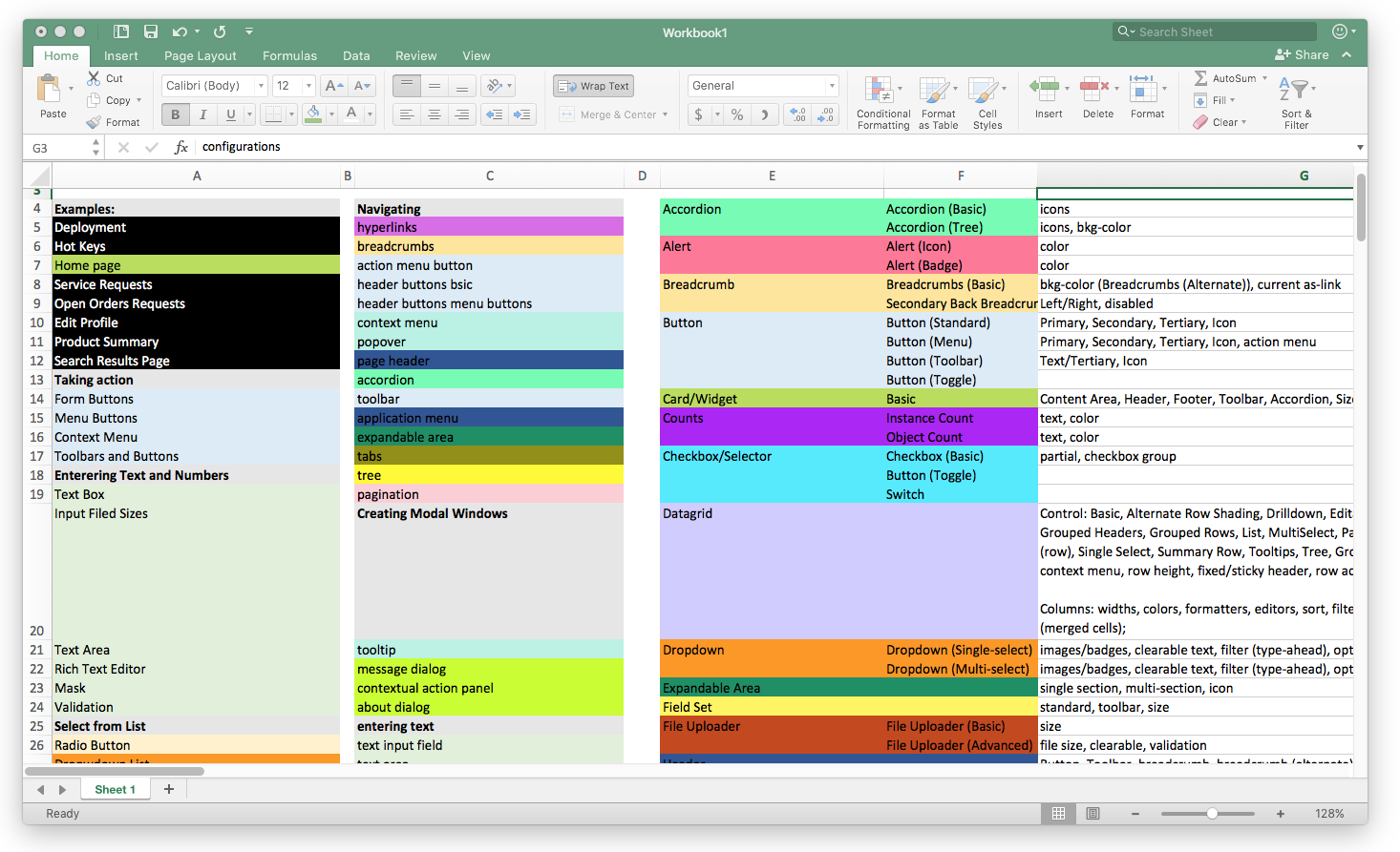
As a large enterprise company, we have lot of clutter. We first audited all of our components and started to dive into them to better understand their similarities and differences. This led use to bundling duplicate components and removing others. We wanted to pare down our components into the most used and heuristic ones we could. This also informed the components naming conventions. By removing the use case from the naming convention, it could more easily be understood how components could be used in many different scenarios.

Goal 2: Easy customization with built in consistency
Problem:
We would receive a lot of questions about how to customize or change components. Since our jQuery components were built monolithically with code being dependent or wrapped, this was hard to do. Our components were too rigid, any alteration required manual overrides.
In addition, the component documentation listed pixel perfect specs for individual component dimensions, padding, and aspect ratios. Many designers and product teams felt limited by these hard lined specs.
Solution:
In our new design documentation, we didn’t want to focus on these tiny details for every individual component. Given the product audits we conducted, it was more important for us to be able to clearly explain why to use a component in a design instead of splitting hairs over the UI of one single component.
One way we addressed both customization and consistency was through our grid system. By leveraging the grid, designers can use the columns as a unit of relative measurement instead of specific pixel specs. In combinations with our 8pt vertical rhythm, we don’t have prescribed padding and spacing, but instead a designer can have more customization within units of 8.


Goal 3: Democratization with continuous iteration
The problem:
Within the Soho ecosystem, we had a couple of different websites for different key audiences. These sites were built separately and were maintained by different people. It was unclear which site was the most up to date. Furthermore, there was a lot of toggling in order to get the full story about component.
With the new design system, we really wanted to address the “single source of truth” problem. We wanted to create one central place for everything, for every user type.


Solution:
One part of solving this issue was thinking about how we wanted to host the site. The current component library and its counterparts are all behind a firewall. This created one more blocker for our users to reach the meat of what they needed. We didn’t want any more obstacles for our users, so we decided that the Infor Design System should be open source. Now anyone can reach our content.
A another way to create a single source of truth, was by dog fooding our own components. Or in other words, practice what we preach. The old website broke rules or recommendations that our toolkit would make. Users were confused about what the components to use, the documentation of a component, or how we had it implemented on our actual website.
Goal 4: A guiding mission
The problem:
The Soho library was more of a brand name that encompassed our components and some documentation on accessibility. There was no real clear sense of motive or mission. Nothing on what we stood for and what we aimed to do. It was when we started to talk about what our mission was, we really began to uncover some issues in our strategy.
The solution:
The mission or our principles became a shared language where developers, ba’s and designers could start to talk about what their product flaws and how they didn’t align with these new principles. They started to become a framework for us to measure our work across teams while serving as a motivational tool to push our work more.

The Team
Ai Krobe, Chris Lepore, John Macaluso, Kayiu Ho, Kelsey Smith, Laura Hahn, Nick Wynja, Parisa Bazl, Thea Katz
Deliverables
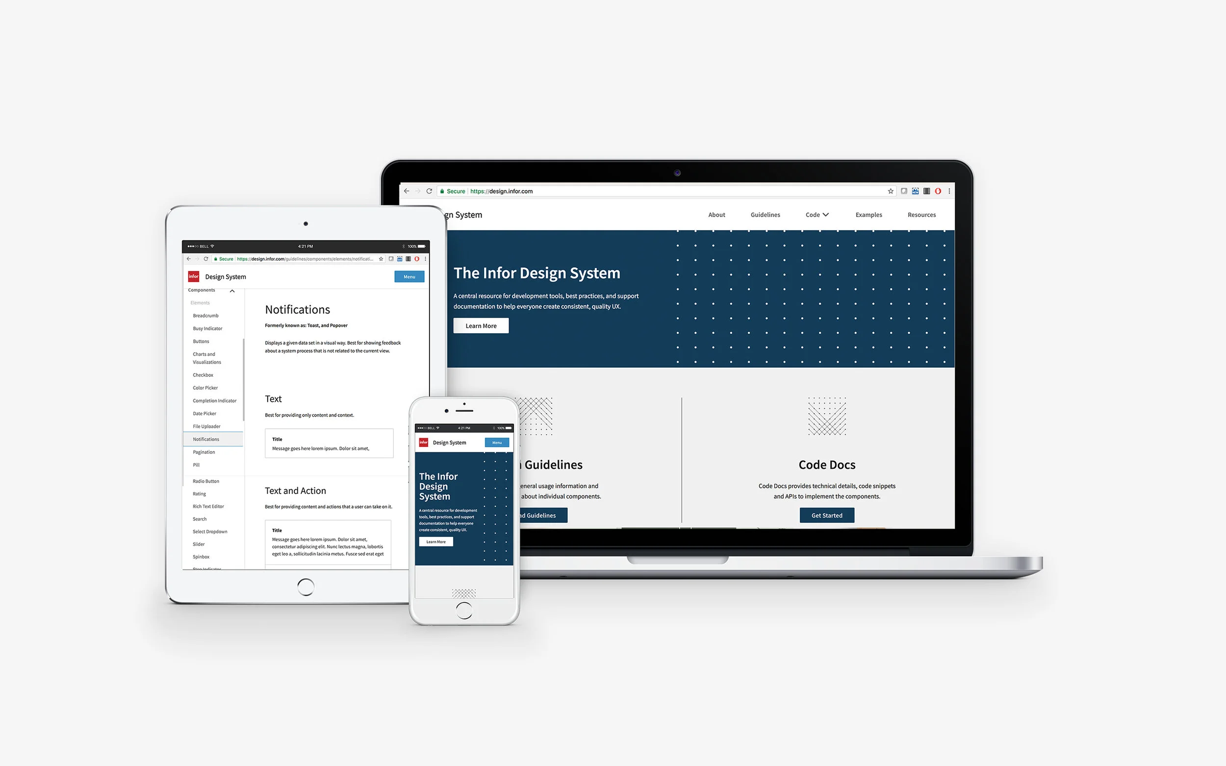
Website
• Responsive product website
• 56 pages of component documentation
• 4 pages of UX design best practices research and documentation
• 7 pages of support documentation
Product
• Updated component taxonomy and naming conventions
• 10 functional utility classes
• 12 updated jQuery components
• Open source Github repository
• Versioning support


